
Although it is more expensive to create a website that works well on both mobile devices (with varying screen resolutions) and desktop computers, the cost of lost opportunity far outweighs the cost of accommodating mobile devices, especially given the rapid growth of mobile adoption in the coming years.


Although it is more expensive to create a website that works well on both mobile devices (with varying screen resolutions) and desktop computers, the cost of lost opportunity far outweighs the cost of accommodating mobile devices, especially given the rapid growth of mobile adoption in the coming years.

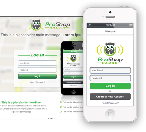
The design of a website that is responsive is one of the most important factors to consider.Your website will adjust to any screen resolution in this section. The website is responsive to both tablet and mobile screen resolutions. Because website content aspects must be reviewed and given importance when screen sizes reduce, this approach requires more ahead planning than a traditional website. Google recommends responsive design websites for SEO.
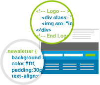
This is where you have a same URL but different (CSS) style sheets based on the device type accessing your website. This indicates that the same html code is utilised, but the style sheet is changed. It takes a little less time to plan than responsive websites.

This is where you have a mobile website with the address m.yourwebsite.com and a desktop website with the address www.yourwebsite.com.
Depending on which device a person is using, the website sends them to the correct URL.