
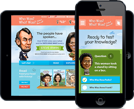
A responsive website is one that adapts to each individual visitor's device, whether it's a desktop, smartphone, or tablet. A flexible website dynamically resizes its information and visuals to fit a wide range of screen sizes, making it effective and simple to use on any device.
A responsive website is one that adapts to each individual visitor's device, whether it's a desktop, smartphone, or tablet. A flexible website dynamically resizes its information and visuals to fit a wide range of screen sizes, making it effective and simple to use on any device.